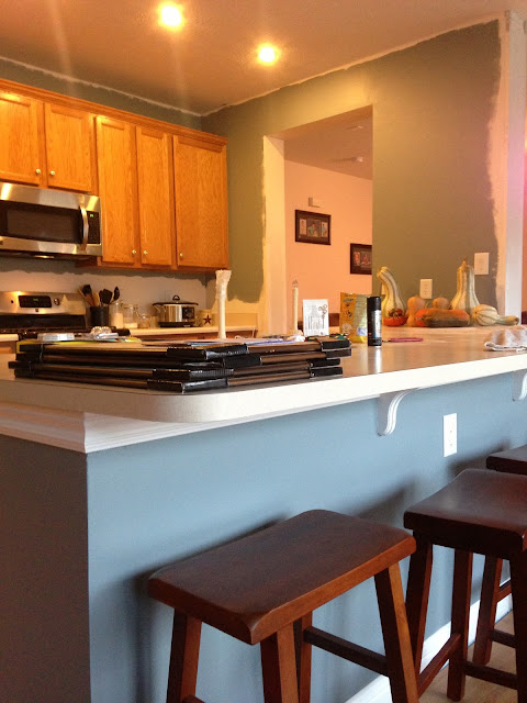
The blue also had to coordinate with the "hot chocolate" color of our pantry from certain angles, and it had to coordinate with whatever color we chose for our living room, since they now felt like one big space.
I will post better pictures of the green chosen for our living room and show how the blue of our kitchen also made its way into our living room curtain fabric choice, but I haven't posted about the living room makeover yet!
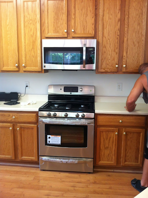
Besides painting, one of the first things we had to do was replace almost every appliance in the kitchen. There was no oven. There was no refrigerator, but we had brought the one from our old house. The dishwasher didn't even function, and the microwave was a little sketchy.
We chose stainless steel appliances because we'd already started a trend toward stainless steel everything! (I must have had the crockpot on with something yummy in it when I took this picture last winter...)
The plan is to one day stain all of these cabinets to a darker, richer maple color and to install a higher quality wood flooring also. The flooring that is there now is very cheap laminate, damaged in many places, not installed correctly (boards are shifting everywhere!), and there are gaps between the floor and baseboards all the way around the room, creating places for dirt to pile and bugs to get in. It's not good.
See how dirty the walls were? And how incorrect the floor installation was? There should at least be some quarter round pieces of wood there where the floor meets the baseboard.
We had to replace the kitchen sink, too. It was very old, dirty, and shallow compared to what we had at our old house.
The sink we chose was found in the reduced-price section (like most elements of our new home thus far!). I've always wanted one of those faucets that you can just pull off of the base, and I finally found one for a decent price!
The counter top was completely separated from the wall when we moved in. Either it had not been installed correctly or it had been pulled free from the wall at some point. That is still not fixed because we intend to replace the counter tops, once we can afford to.
The lighting above the kitchen sink was kinda plain and cheap.
This is actually the FIRST curtain fabric that I chose and ended up replacing because it just wasn't right. You can see the new sink here, the blue paint color, and the single backsplace square that I bought for reference.
We replaced the light with a stainless steel colored pendant, and I chose a different fabric with a simpler color palette and pattern. This one has little birdies and leaves in it, which coordinates with the leaf pattern on our cabinet hardware.
For our wedding anniversary in April, my husband found me these 2 coordinating gems:
An adorable ring holder and this framed keepsake commemorating our establishment as the awesome couple we are ...
We got rid of the blinds on the back door, mostly because they were stained badly and pretty yuck. We did, however, keep the wooden blinds on the windows. These are the only two windows in the house that have wooden blinds, and they're in great condition.
I intend to take that light fixture down just as soon as my husband finishes the recessed lighting project that he started months ago ... (Are you listening, honey?! Can we please get that finished before the holidays?!)
There's another Before picture of the kitchen where you can see the old light fixtures.
And here are some shots of the recessed lighting that my husband and brother-in-law installed, complete with dimmers! I LOVE it!
There is a row above the main alley, a row above the center counter top, and there *will be* a third row above the dining table and backdoor area.
The only thing that I don't love about the lighting is the fact that each row has a light switch, but none of the light switches are next to each other, and their placement doesn't make sense either. That's annoying, but otherwise, I love how I can control the way the room looks by turning on certain rows and dimming them.
A few months ago, we ended up having to replace the refrigerator, too. It just couldn't keep up anymore, and our food was spoiling way too quickly.
The best picture that I have of the fridge is the one I took of our cat, seeking refuge from the Great Dane that we were fostering at the time. Thanks to this hefty purchase, our plan to replace counter tops and install the backsplash has been put on hold.... <sad face/> ... I'm thankful for interest-free financing.
The kitchen is a work in progress. The back door and window treatments, counter tops, flooring, cabinets, and the third row of lighting are all still to come, as well as decorative accents that I'm keeping my eye out for now that I have the birdie theme chosen.
On to the Living Room!


No comments:
Post a Comment